Zeit, time travel Tourism
Imagine time travel has been safely tested for a decade. Zeit, a new subsidiary of Richard Branson’s Virgin empire, is now offering highly curated time travel tours to the public. With 289 destinations from prehistoric times until today, Zeit needs an e-commerce site for visitors to find and reserve trips.
Project Introduction
Duration: 80 hrs (4 weeks)
Role: Product Designer
Skills: UX Design - UI design - User Research
Overview: Designing an e-commerce site for a new and innovative technology
Conceptual Project
Research
Research Goal
We want to learn how users book travel, what they believe to be the most important aspects of the booking process, so that we can create a product that allows our users to effortlessly plan their next vacation to the time and place of their choice.
Research Objectives
Determine how people book trips
Determine demographics of most bookings
Figure out main reasons why people are booking trips
Understand the process of booking a trip for the average user
Determine when and how people are booking trips
What role does vacation play in people's lives
Understand the process of prioritizing when and where people want to travel
Methodologies
Competitive research to see what other travel competitors offer and at what price points.
1:1 User interviews to determine exactly what a user is looking for on a travel site.
Contextual inquiry to watch and observe how people book trips.
Overview of Findings
All participants had different intentions, destinations and travel plans, but overall what they all had in common was their desire to find the deal within their budget, and all relied heavily on reviews to make sure they were making an informed purchase. They were all willing to do research on various travel sites to achieve their goals, some planning as far in advance as 1-2 years, but on average most took planned trips involving airfare 3-6 months in advance.
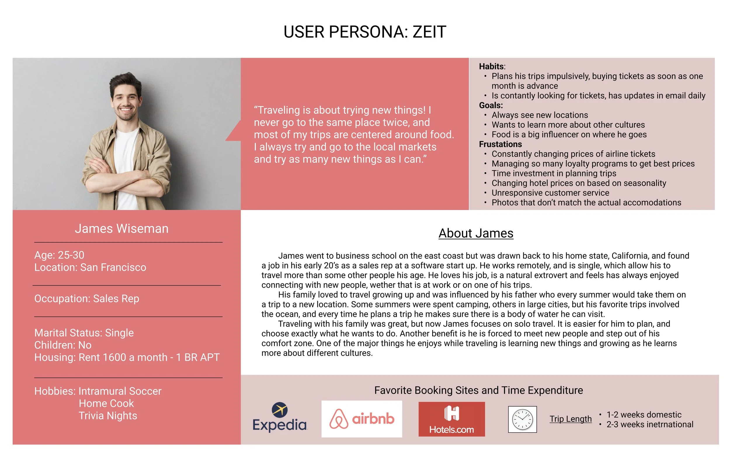
Persona
Imagine time travel is possible. Oh the possibilities. Where would you go? WHEN? These are the big questions I was trying to answer as I worked on this project. While the technology may be far-fetched the execution for this project would be tangible. I began by treating like any other travel site - with a few caveats along the way.
So, like any project the first step was learning more about the problem. Before we could start to talk about any solutions we needed to explore the idea, with a few assumptions in our back pocket, and start to look at how to solve the problem: creating a site for time travelers looking to book a trip.
After speaking with some particiapants about how they travel, what their fears and goals were when traveling, I was able to put together some personas that helped define how a user would use this site. I started all the interviews asking quesitons about how they currently book trips, and only at the end did I ask questions of a more conceptual variety.
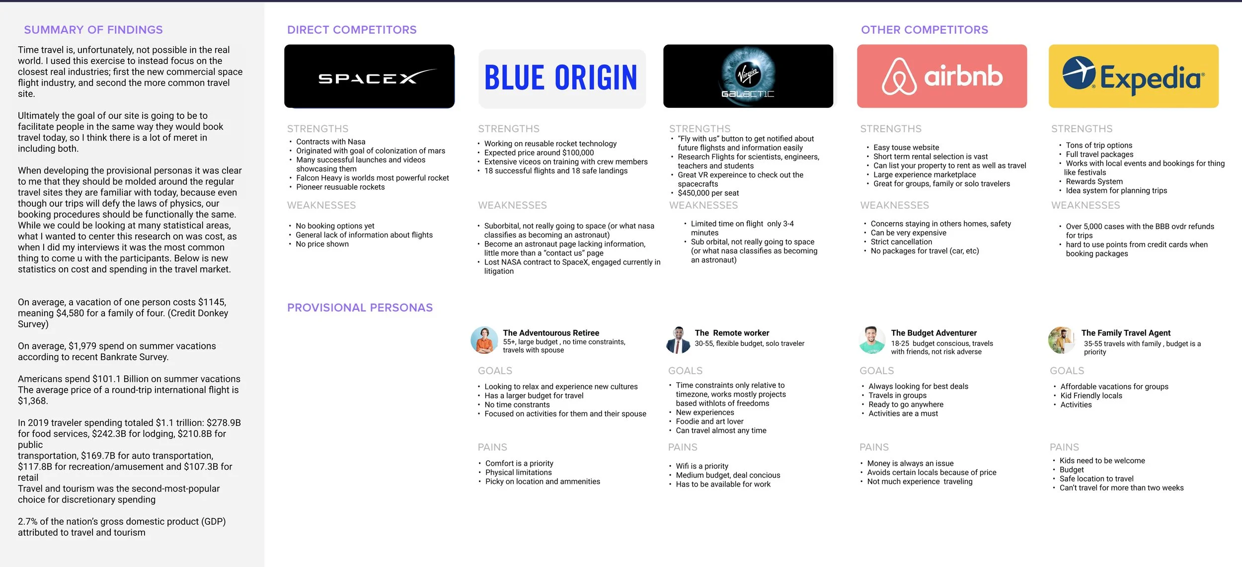
Research Summary and Provisional Personas
Site map
Card Sorting
SET UP
4 users were selected for this card sorting exercise. 3 of the participants had previously answered questions in the 1:1 interviews and a fourth was added to get a larger sample set of data
Card Sorting was done remotely through Optimal Sort
It was a closed sorting method, using 20 cards and 4 categories
Categories included
Relaxing Getaways
Exciting Adventures
Group Adventures
Couples Vacation
Conclusions
9 out of 20 cards had 3 out of 4 users in agreement
the 20 Cards only 2 were in total agreement among the participants
2 out of 20 cards were placed in to all fours categories
There seemed to some confusion for between 2 categories “relaxing getaway” and “couples vacation,” of the 4 participants 2 are single and 2 are in a couple. This may have led to the split in these answers as the users saw them reflecting different personal experiences.
Information Architecture
CONTENT ORGANIZATION
I focused on three goals when creating and organizing content.
Reconceptualize filters and trip categories as they relate to time travel. Analysis of patterns on existing travel sites showcased common patterns, but with time travel as a constraint I need to come up with new solutions
Introduce the concept of time travel, any new technology requires educating the market. Make sure people understood that this technology is safe.
Provide packages with stunning historical events. Make sure to highlight the greatest aspects of our shared history to showcase seemingly endless opportunities to entice the user.
Interaction design
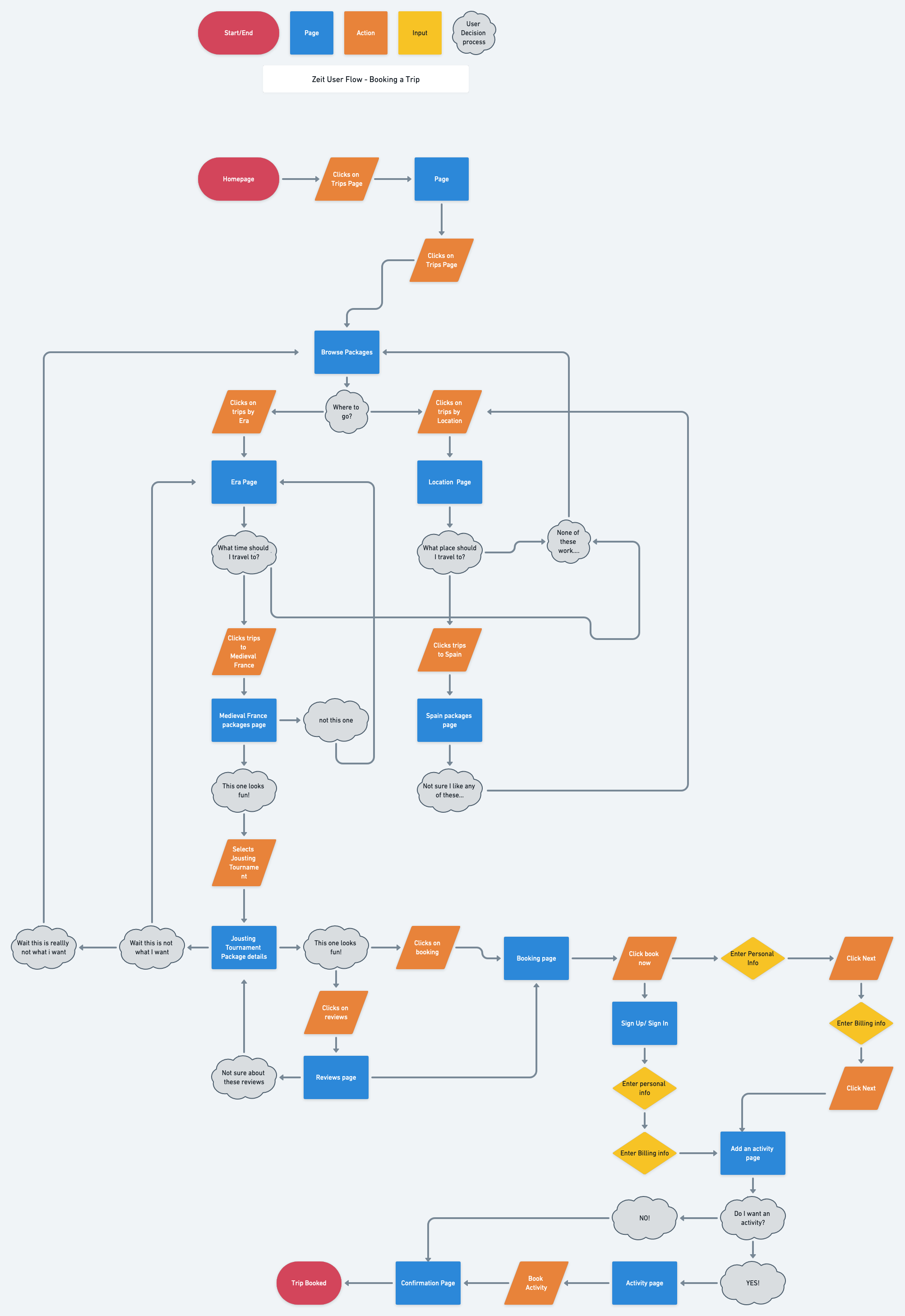
Task and User Flows
User Flow - Booking a Trip
Design
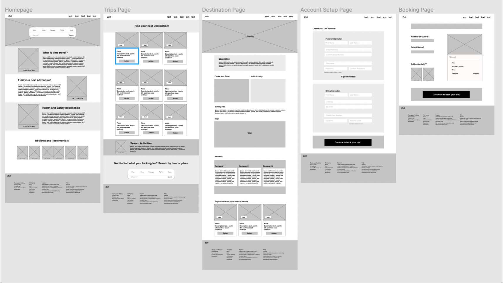
After working through all the aspects of the necessary flows and interaction designs it was time to start on the designs. I started working with the UI for desktop and made those all responsive to tablet and mobile interfaces. Below are the final wire frames and designs.
Wireframes
User Interface
Usability Test Results
Last but not least it was time to test the designs. We had 6 participants for this exercise. Overall the participants found the site to have an appealing look and said the concept was very interesting. Pricing came up a few times, this was interesting because while I should have included it on the package page without the pricing information, even in a fictitious setting, budget still seemed to be a top priority for people. The task was relatively simple and all participants were able to complete it with ease. It would have been interesting to have more buttons and flows tied in to see how people searched, as all participants clicked around to try and find out more information. The task was completed at different speeds, some taking their time to look at the page in detail first, slowly going through the process. While two completed the task quickly and then went back to give a critique on how the pages looked.
It was successful in the sense that people thought the site looked clean and easy to read, they were able to go through the steps with ease and the booking process was familiar to all participants. Search results also came up a few times as all three participants wanted to see how certain trips would be clumped together, all commenting on the “trips similar to your search results section.”
Photos were well received and were said to match stylistically. The major pain points were around two things; pricing and more options. All participants wanted a more in depth test and all commented on the fact that pricing may be more prominently displayed. Not as a secret item at the end. Usability test was successful as it provided the flow and found common complaints among participants.
